withStyles

It's like the material-ui v4 higher-order component API but type safe by design.
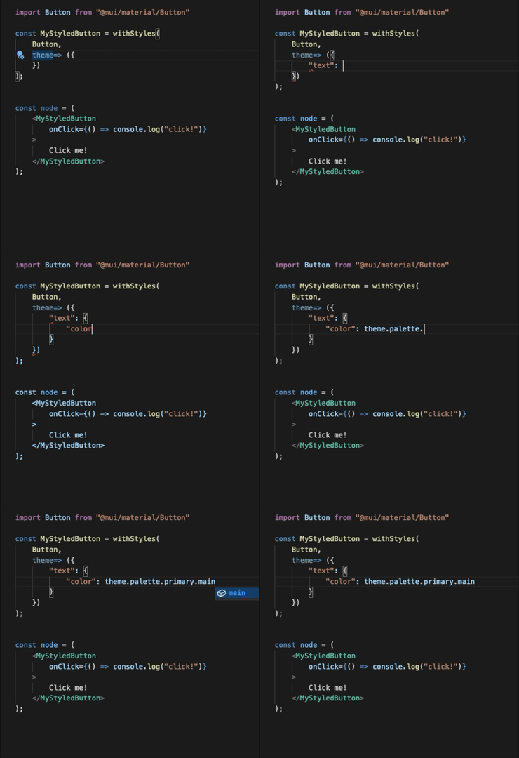
IMPORTANT NOTICE: Don't be afraid to use as const when you get red squiggly lines.

You can pass as first argument any component that accept a className props:

function MyComponent(props: { className?: string; colorSmall: string }) {
    return (
        <div className={props.className}>
            The background color should be different when the screen is small.
        </div>
    );
}

const MyComponentStyled = withStyles(
    MyComponent, 
    (theme, props) => ({
        "root": {
            "backgroundColor": theme.palette.primary.main,
            "height": 100
        },
        "@media (max-width: 960px)": {
            "root": {
                "backgroundColor": props.colorSmall
            }
        }
    })
);

You can also pass a mui component like for example <Button /> and you'll be able to overwrite every rule name of the component (it uses the classes prop).

import Button from "@mui/material/Button";

const MyStyledButton = withStyles(Button, {
    "root": {
        "backgroundColor": "grey"
    }
    "text": {
        "color": "red"
    },
    "@media (max-width: 960px)": {
        "text": {
            "color": "blue"
        }
    }
});

It's also possible to start from a builtin HTML component:

const MyAnchorStyled = withStyles("a", (theme, { href }) => ({
    "root": {
        "border": "1px solid black",
        "backgroundColor": href?.startsWith("https")
            ? theme.palette.primary.main
            : "red"
    }
}));

You can experiment with those examples here live here, you can also run it locally with yarn start_spa.

Last updated